Employing Google’s Chart API in a Claris FileMaker app
Are you a visual learner? I am. You can tell me stuff; you can write me a narrative. These will help me begin to understand or recognize trends, but a visual representation like a chart can bring the details to life.
Say I have questions about income for my business, Wolfskill Consulting, Inc.: Which clients contribute what percentage of income, and how does the business’ income break down in terms of industry? This kind of business intelligence helps me market what I do and generate leads.
Say I had recorded a list of payments, like this one:
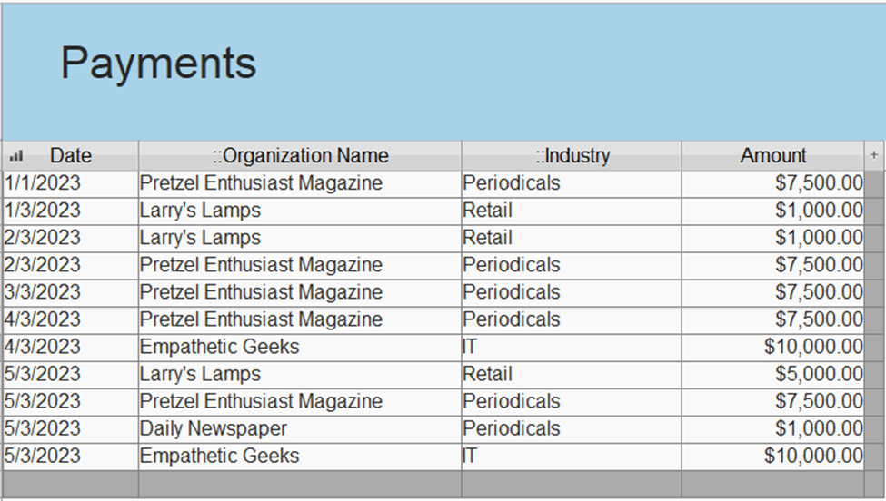
You can see that I am capturing not only the payments but also the name and industry of clients making them. Studying this list, I can begin to understand where money is coming from. I can see, for example, that this month (May 2023) has been particularly good. Pretzel Enthusiast Magazine uses our services a lot. But this list doesn’t show me the proportion each organization or industry occupies in relation to the others. It doesn’t show the percentage of the total. We can best represent that detail through a pie chart.
More and more, Claris FileMaker can talk with other kinds of software and web services. To create the visualization we have in mind, we can take advantage of Google’s Chart API (https://developers.google.com/chart). By integrating Google’s API with data in Claris FileMaker, I managed to create a helpful visualization. (Please see below.)
When I click on the largest slice, the chart shows me the total amount of income from Pretzel Enthusiast Magazine as well as the percentage of the total.
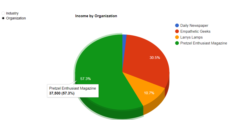
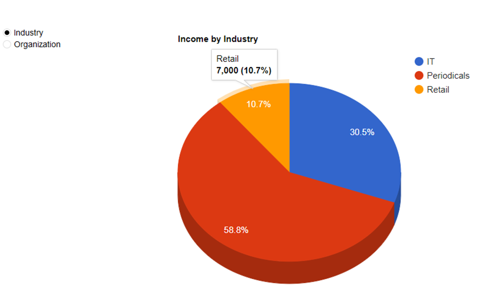
I added a radio button to allow options to view income by industry or organization. If I select Industry, the pie chart updates:
This kind of visualization can play an important role on a dashboard or other tools to provide business intelligence.
To get a sample file or chat about Claris FileMaker, please drop me a line at jud@wolfskillconsulting.com or call 857 891 5764.