I know, I know: You’ve asked yourself this question so many times. You have queried your spouse while getting ready for work in the morning. You have turned to the person at the next table to you in a restaurant and asked this question. It’s constantly on your mind.
Okay, perhaps it isn’t, but say you’re just geeky enough to imagine apps on tablets. You may not know what FileMaker is, and that’s fine too. Let’s assume you have a work problem to solve and you suspect a tablet app might help.
Claris FileMaker software works on iPads, Surface Go, and other tablets. Custom apps on tablets offer portability so that users can employ apps while reviewing production in a warehouse, inspecting ships, or taking attendance in a classroom.
But there are a lot of portable devices out there. Which one makes sense? I argue it depends a lot on which operating system you like better and how comfortable you are with FileMaker’s native status bar.
When I develop applications, I want to take advantage of the bells and whistles on the device they operate on. I’d like to shape the screens and buttons to look appealing. Will the user take advantage of the touch screen or want a physical keyboard? The competition to look as cool as other apps is significant: There are lots of attractive apps, especially on portable devices. The emergence of iPhones and tablets has definitely upped the UI game.
My favorite app is a parking app. There’s nothing playful or fun about paying for parking, so you might think I’m crazy, but hear me out. The steps are as follows: I use a designated number to find the location of where I’m parking, select the license plate of the vehicle I’m in, indicate that I’d like a new parking session, and click to pay for it. It already has a default credit card selected. That’s all it takes: about 3 clicks. There is very little happening on the screen at any given time, and only a few big buttons with big text on the screen. I confess: I love it.
I want to offer that same kind of simple, intuitive experience whether on an iPad or a Surface Go. I assume a tablet version of an app will operate with larger text, bigger buttons, and less data on the screen. Building for a tablet makes the users and I break down decision making and data consumption into the smallest possible units. (Don’t tell anyone, but it’s kind of fun.) Going back to the parking app example, you make one choice per screen: Which car am I using? What location am I parking at?
When considering whether to choose an iPad or Surface Go, consider first whether the person prefers Mac or Windows. After all, the FileMaker app will only be one offering on the device. What else will the user want to do on the tablet? We can make a crisp, intuitive app that fits the device either way. Second, how familiar and comfortable are users with the native FileMaker toolbar at the top of the screen?
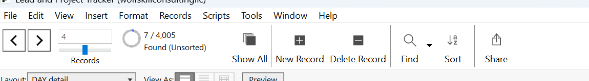
Figure 1: The status toolbar as it appears on FileMaker Pro on a Windows desktop or Windows tablet.
On a Surface Go, this toolbar can be hidden or revealed, and it looks the same as on a desktop version of FileMaker. Figure 2 shows the app I use to run my company, called Lead and Project Tracker, with the status toolbar visible.
Figure 2: A screenshot from my Lead and Project Tracker as it appears on a Windows desktop or Surface Go.
For the iPad, Claris offers a different version of the FileMaker client, so it already looks different from the version of FileMaker that you see on a desktop. Features available on the one toolbar on a desktop are available from different toolbars at the top and bottom of the screen. Figure 3 shows the same screen as Figure 2 but from an iPad.
Figure 3: I have clicked the arrow at top left to see one toolbar, and a navigation toolbar appears at the bottom of the screen. Please note that this screen is not optimized for the iPad.
If the users like the FileMaker toolbar offered by the desktop version, they may be most comfortable accessing FileMaker from a Surface Go tablet. On the other hand, if users aren’t familiar with FileMaker or don’t like the status toolbar, they may benefit from an iPad app. What do I like best? Hiding the toolbar and only making a few buttons per screen.