By Jud Wolfskill, Wolfskill Consulting LLC, jud@wolfskillconsulting.com, cell 857.891.5764
A custom software project requires figuring out the best way to get data into an application and, once there, to present the data so that it is meaningful and helpful. For example, an application can take charges for products and services and generate invoices or profit-and-loss statements from them. In my last post, I showed how pie charts can help a business understand the proportion of its income a particular organization or industry makes up. What if, however, the data represents locations?
Say your business or organization features crews going out to work on jobs. You have to schedule when and where the crews go. You would benefit from knowing where your jobs are so that you could plan where your crews went accordingly. If there are 3 jobs in the same town, you could have a single team take care of all 3 jobs.
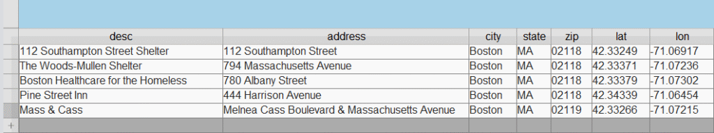
Suppose your application tracks resources for unhoused people so that providers could refer them. The data itself might look like the following table:
With a recent version of Claris FileMaker, a custom application could display these locations on a map that looks like this:
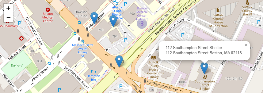
The map could color the markers based on the kind of location it was, and provide more information if a user moused over or clicked on a marker.
To chat about Claris FileMaker, please drop me a line at jud@wolfskillconsulting.com or call 857 891 5764.
Thanks!
Jud